


![YouTube SEO in 2024 [Definitive Guide]](https://getpixie.com/wp-content/uploads/2024/02/shutterstock_1684828252-1-150x150.jpg)
Are you releasing a new app? Take a look at our guide to make sure your logo is something instantly recognizable and quick to click on.
Understand symbolism
There is no room for full words on an app icon; even if there were full words, they would probably be too small to read. For this reason, there are a lot of graphic designers channeling the double meaning of symbolism: a symbol and what it represents on various levels.
Don’t get us wrong: there are definitely brands that feature letters in their app icons, like Facebook and Pinterest. But it should be noted that these are very big established brands, where looking at the “F” on a blue background is already very recognizable. Pinterest even managed to squeeze a pin into their icon to make sure you get it. Smaller apps and brands aren’t afforded this privilege, and your one-letter icon might go right over the heads of users or, worse, be mistaken for something else.
Instead, focus on symbols that showcase what your brand is all about. You can get blatant about it or more symbolic. Say you’re a sports app, MyFitnessPal features a body jumping into the air, which is pretty unsubtle, but Nike’s famous tick or “swoosh” evokes the idea of victory and speed in one. You can boost your app with Apptimizer, which will allow you to buy app installs, but that will lead to nothing if your users don’t instantly know what your app is for.
Be clear on your intentions
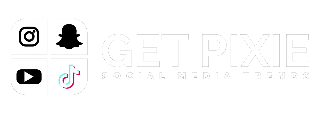
But don’t fall into the trap of getting too symbolic with your icon. Why the Snapchat symbol is a ghost and what that has to do with a social media platform, beyond the concept of ghosting, maybe, is anyone’s guess. But, again, Snapchat is famous enough that it doesn’t really matter.
New apps, however, should try not to be too clever with their symbolism. You’re selling a dating app that’s more about commitment, pick a symbol for an animal that mates for life, like bees for Bumble, or alternatively, if you’re looking for that initial spark that might turn into a fiery romance, go for a fire symbol for Tinder.
Additionally, you might want to make sure that your chosen symbol doesn’t have another meaning elsewhere. There are forums full of botched logos that look like something else, and just because you think the Buddhists should reclaim the swastika doesn’t mean the rest of the world does, so don’t add it to your meditation app. And maybe rethink that eggplant symbol for your salad bar, for example?
Keep it simple
The thing about app icons is that they need to be adaptable. They are going to be on a very small screen in comparison to TVs, PC monitors and billboards. This means they have to be clear, instantly recognizable, and easy to shrink and expand as needed.
So, take it easy on the minor details. If you look at evolutions of logos of brands that have been around a while, like Facebook, for example, you’ll note that an already simple concept – a white F on a blue background – has been changed to remove the “sheen” and gradient of the blue and the letter. The font has never changed, but did you notice it’s not in Times New Roman with all the unnecessary tails at the end of letters?
Aim for simplicity and boldness. A bold color, a simple shape or symbol, with bold lining if needed.